Bringing data to life

As Spider-Man — or was it Gandhi? — once said, “With great power comes great responsibility.” Equally accurate: with great meme skills come great responsibility.
Two maps of the U.S., one depicting 5G towers and one depicting COVID-19 cases. Which is which? Your guess is as good as mine. The point is, it’s a goddamn conspiracy.
With increasingly-accessible digital data visualization tools, even a technically accurate map, graph, or infographic representing incomplete or manipulated data can appear trustworthy. Before you know it, it’s been shared across the planet and John Oliver has to scold us about buying its malarkey.
Here he is, explaining why strikingly similar heat maps of COVID-19 infections and 5G towers are no cause for concern, despite what your high school boyfriend posted on Facebook. They simply reflect population density.
How do we use the power of data visualization responsibly? Just like with any other historical analysis, placing information in context yields deeper, more accurate insight. And, to communicate our findings well, we historians must treat data visualization as a form of hisorical research, not just a handy accessory to our writing.
Data out of context is easily manipulated, but in context, we can find new meaning in the information. Data journalist David McCandless illustrates this well by placing global military data in context. The United States’ military budget outsizes those of the rest of the world combined. Yet, when visualized relative to GDP, the U.S. ranks eighth; seven other nations spend a bigger percentage of their GDP on the military. Similarly, China’s army dwarfs all others in personnel numbers — but measured per capita, China’s army is relatively small and North Korea tops the list. What’s significant about these two examples is that the simplified view reinforces (and may have shaped) common assumptions, while the contextualized data reveals a more complex and arguably more accurate perspective.
Our task, then, is to ask what information needs to be included in our data visualization to tell a more complete story — is it change over time? Comparison between two data sets? Adding information to underscore complexity? The questions we ask ourselves about data visualization begin with the questions we ask ourselves about any historical research. Fundamentally: What’s missing from this picture? How can we shine light on gaps in the story? Florence Nightingale, driven by these questions, managed to turn Crimean War casualties around by creating a visual representation of disease fatalities eclipsing battle casualties.
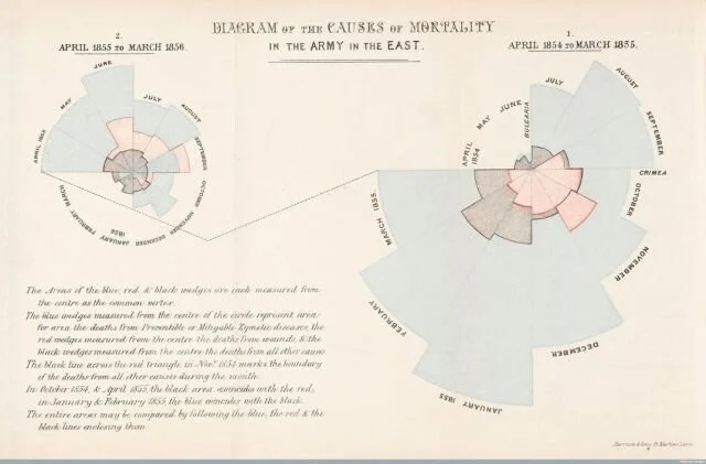
Florence Nightingale’s “rose diagrams” — simple, impactful design.
“The queen and Parliament could see at a glance the importance of hygiene; they quickly set up a sanitary commission to improve conditions, and death rates fell. Nightingale became one of the first people to successfully use data visualization for persuasion—to influence public policy,” Smithsonian Magazine’s Clive Thompson writes. Data visualization need not be fancy to convey meaning; it needs to be thoughtful, critical, and clear.
Quantitative historical research now requires understanding the mechanisms of data visualization. While the concept isn’t new, digital tools for making sense of “big data” are — as are the vast quantities of data available for parsing. As historians, most of our work will be finding new ways to understand and visually represent the past, or interpreting existing data visualizations from the past. In the “Fir Trade in Canada: Mapping Commodity Flows on Railways,” Josh McFadden illustrates how old data sets can provide new insights with the use of GIS software.
By mapping late-19th Century railway transport of timber, historians can understand both “geographic distribution of biomass energy production and consumption and the temporal trends during a period of intensive economic growth (and hence energy expansion).” Standford Libary’s “Data Visualization and the Modern Imagination” collection categorizes and interprets historical data visualizations. Frederick W. Gibbs argues that due to its expansion of our analytical capicty, data visualization has become much more than an accessory to historical writing; it is a significant arm of the discipline. The data visualizations we create influence discourse, and all of that will become the history of this moment — just as the influence of Nightingale’s map became a part of the Crimean war story.
With these tools, we have much more powerful ways to understand the past. As such, we should approach creating — and critiquing — visual representations of data with the same intellectual rigor as historical writing. That means that we must all become polymaths. “As larger and larger archives of human cultural output are accumulated, historians are beginning to employ other tools and methods — including those developed in other fields, including computational biology and linguistics — to overcome ‘information overload’ and facilitate new historical interpretations,” writes Micki Kaufman, creator of the “Quantifying Kissinger” visual tool for historians navigating the U.S. State Department’s Kissinger Collection. Gibbs’ antidote to the challenges of visual data analysis is transparency. We would not accept a piece of historical writing without clearly-expressed methodology and sources. The same should be true of visual histories. So, our visual histories need thorough explanation and interpretation.